What is Corti?
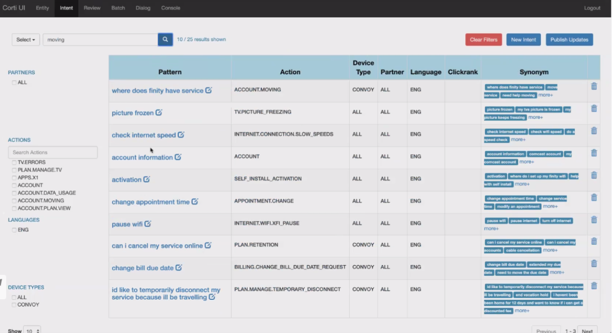
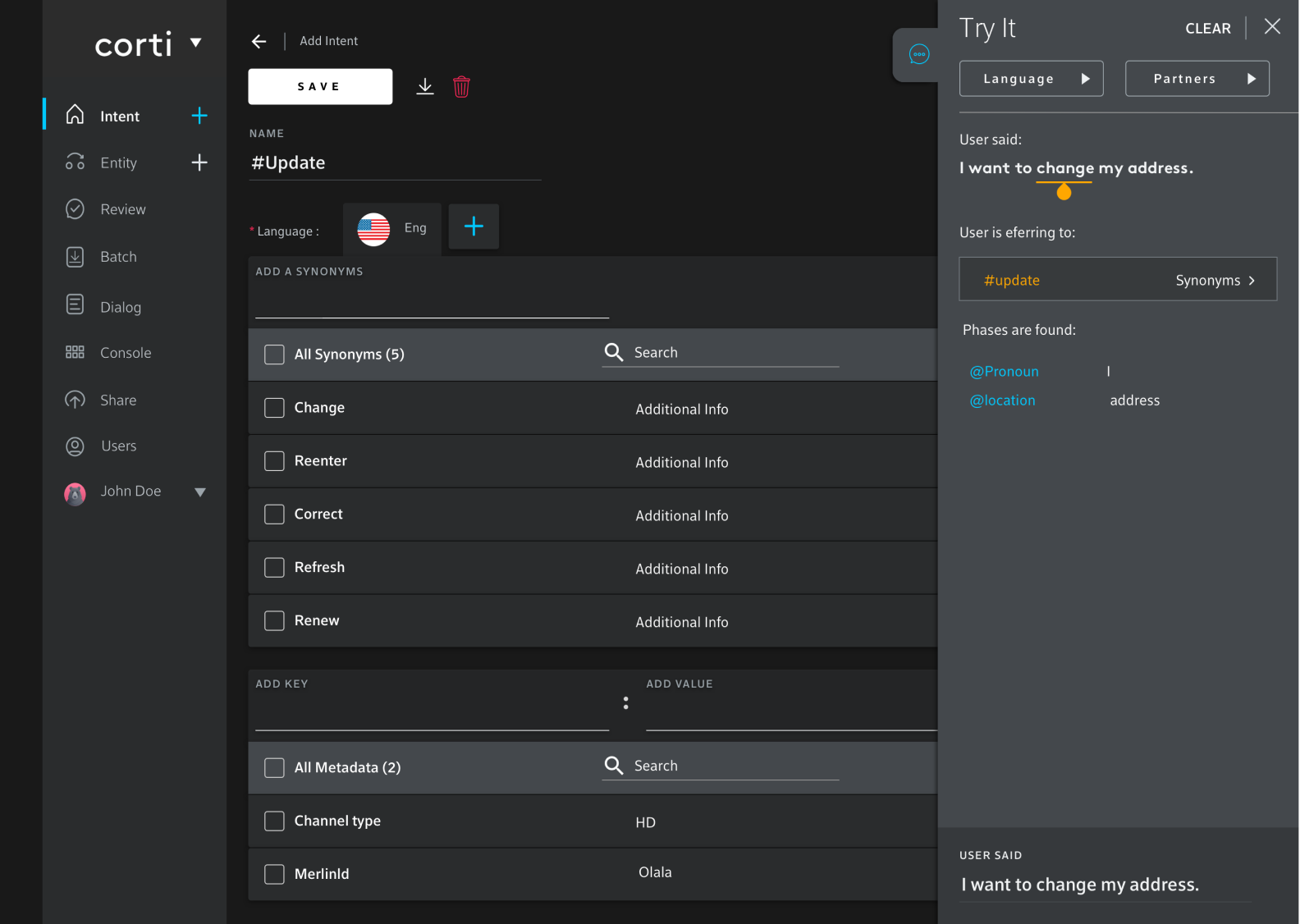
Corti UI is a self-service tool used to author NLP(Natural Language Processing) systems. The main goal of the UI is to manage all interactions the agent team needs to do to configure Corti per their needs and to manage the entire lifecycle of their agent from a single interface. This includes adding/modifying/deleting agent-specific data such as patterns, entities, business rules, and dialog flows.
Identifying Opportunities
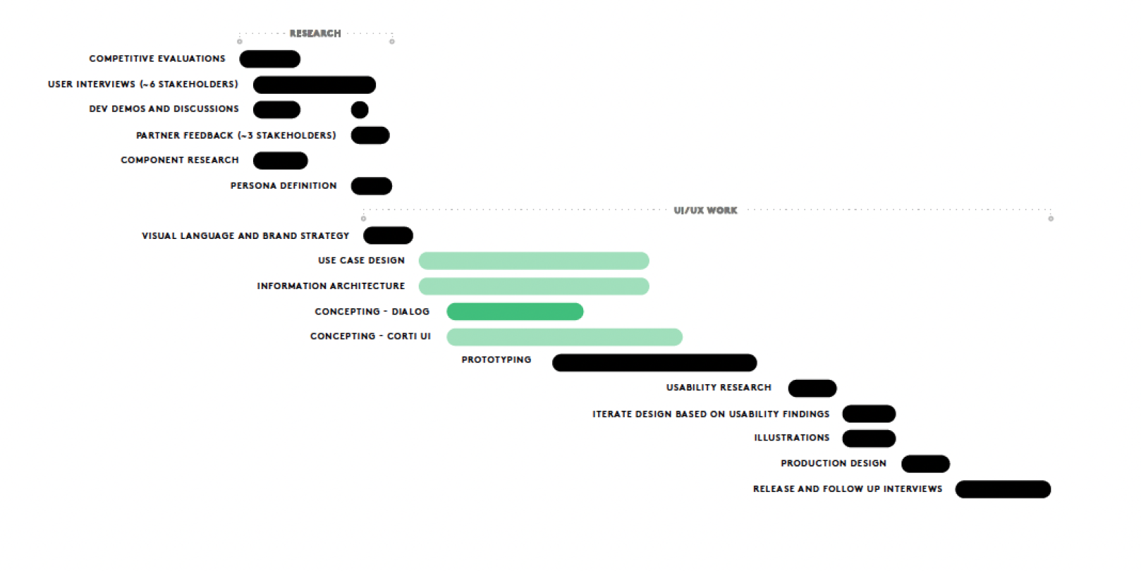
Lack of robust UX research/discovery approach was the underlying problem for the existing solution. To establish the experience point of view, I conducted research in the following areas:
The Legacy Platform: In this audit, I aimed to identify the key workflows that related to the jobs to be done by the user base. I also searched for interface and experience inconsistencies to address as research went on.
Support Cases: Paying attention to case categories with high volumes, reading individual cases started forming a story that could be related back to experience and interface issues.
Internal Stakeholder interviews: I aimed for the support, product, engineering, accesibility team, to understand technical capabilities/constrains; our primary users: Entertaintment, Home, Sports, Xfi( internet provider) departments to begin understanding their day-to-day interactions with the tool. The senior leaders served as the source for business goals and creating alignment between user and business needs.
User Interviews: The most critical ingredient in this “recipe”, qualitative interviews were conducted to understand the jobs to be done, the priority for the user, and what their process were. Our stakeholder interviews helped me generate right qualitative questions to obtain context relevant information and insights. These interviews helped me empathize with the end users, as well as the decision makers.
Primary Research and Findings
Internal Stakeholders and User Interviews
Using qualitative techniques like interviews, observing tool use, and walkthroughs, I sought to solidify the foundation I’d built in my previous research, while maintaining high levels of empathy towards the user.
In interviews, we would touch upon not just how the tool was being used, but also which workflows would make the process more efficient and integrated for various facets of the interconnected departments to prevent duplications. This was a major milestone on my end to increase synergies between departments and reduce preventable extra work hours needed to implement same features over and over again. Walkthroughs of the existing tool helped shed light on the workarounds in play, along with layout failures, in-tool language improvement opportunities, and generally give deeper insights into what the users’ expectations were.
Corroborating data from surveys, internal and, user interviews led to personas being formed.
Competitive Analysis
A competitive analysis was conducted to understand how direct and indirect competitors were appealing to the same set of user needs. This helped further my understanding of the user base by giving a different perspective on how mental models, jobs to be done, etc. were being approached. From a strategic standpoint, learning about positioning techniques helped me form usable specializations from various competitors directly applicable to our unique needs without being generic.
User Persona Definition
Based on interviews with users and a base knowledge of the tool derived from stake holders I have identified four spesific user personas for the product the UI/UX team is designing. There will be some level of knowledge-sharing between partners and domains. Machine learning for semantics would be handy to have in a central knowledge base, but that would require mapping them over localized copies, as well as managing partner versions of databases.
Feature Definition
I engaged with several cross functional teams to discuss their experience using and expectations for the Corti tool. Based on their feedback, we have identified opportunities for work to be done in advance of our design
deliverables in the following areas:
User Permissions
Filtering
Deployment Strategy
Tool Tip // Auto Complete
Environments
Improve Search
Accesibility
Design System
One of the ranking usability issues identified during research was a lack of consistency. In order to discourage such a situation in the future, a design system was created and put into place for the next iteration of the app. This design system had a Sketch Component Library which enabled the design team to move fast and iterate quickly.
Some of the core elements of the design system are:
• Scalability: The design system went through several changes to incorporate patterns and layouts that had app-wide use
• Default, active, disabled states for UI elements
• Do's and don'ts detailed in usage guidelines
• Dark, light, default UI configurations
• Responsive/adaptive documentation
Simplifying
A constant theme across interviews with all the stakeholders that usage was inconsistent and inefficient. Tools for creating voice UIs are all over the map; none have full sets of features so developers have to make concessions or hack together solutions with multiple pieces of software. There were several layers to these problems:
• An interface that’s straightforward that allows to write and test simple language trees.
• Simple approval process for publishing work/checking the work of the team.
• Machine learning that can be shared across partners/platforms.
• Enhanced searching/filtering/sorting capabilities in an enpowering and gracefull interface.
• A process for reviewing merge requests from different teams that service different domains within Comcast, as well as separate domains from partners.
• A process for reviewing merge requests in other languages, while linking similar translated elements to one another.
• The ability to assign accounts/permissions globally.
Over the course of six months, I began chipping away at the problems, one layer at a time. Each iteration was brought to all stakeholders for feedback. I leaned on high fidelity designs and prototypes to test with users. I found that this particular user base faired better when the designs were as close to implementation as possible. On it’s current state tool accomplished:
• Streamlining the flow of natural language processing.
• One tool speaks to all channels.
• Unified several different processes and proprietary, fee-based tools to create voice products.
• Tool tips and auto complte features for speed and ease of use.
I was handed a tool with growing backend capabilities but with restrictive and cumbersome interface. From these, I experimented with the information density, interactions, and presentation. Most iterations received internal feedback. Per 3-5 iterations, I would test these with users of the platform to keep myself caliberated to their needs. End result was a powerful unified tool that can accomodate advanced user needs with gracefull and efficient UX.


